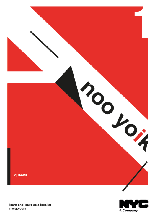
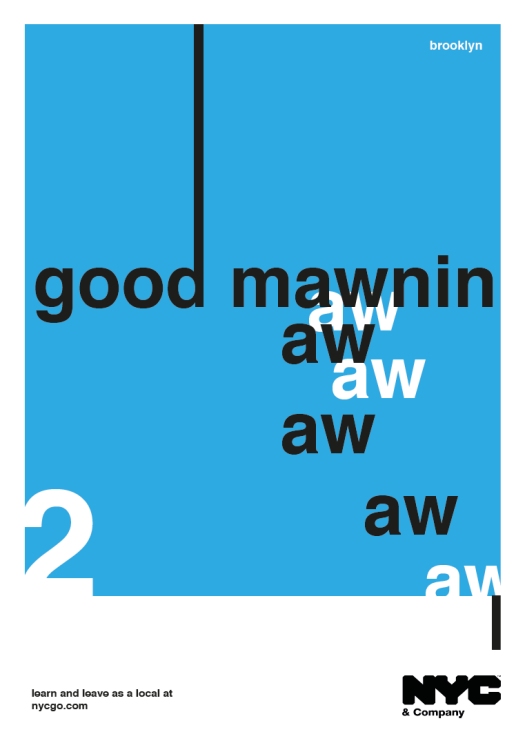
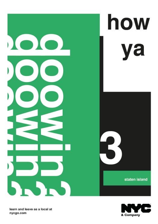
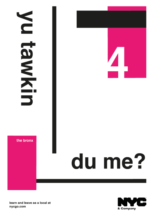
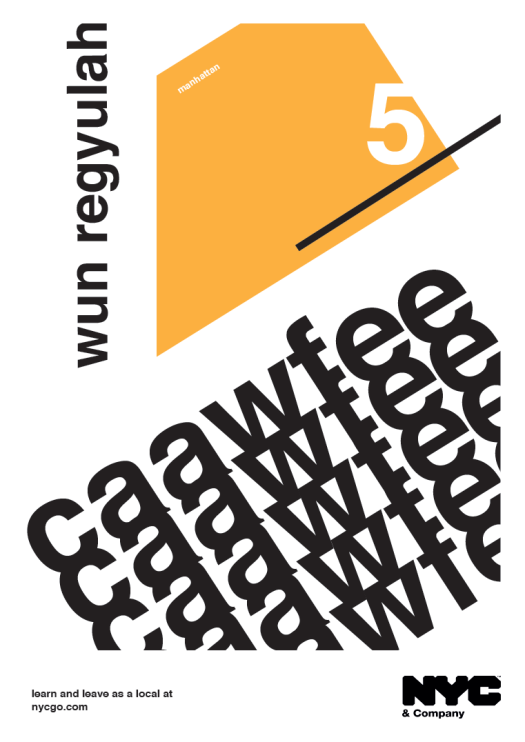
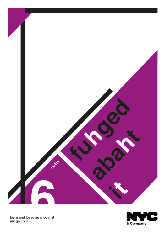
here we have it… a series of posters inspired by Swiss Design, featuring Helvetica; famously associated with Manhattan’s modern day transport systems. the campaign intends to be potentially commissioned by NYC & Company, as a way to maximise city travel and tourism. NYC & Company is New York City’s official marketing, tourism and partnership organisation working not-for-profit to increase economic affluence and spread the influential image of New York City around the world. with the launch of interactive schemes such as nycgo.com, the company is a go to resource for both tourists and locals to explore what to do and see in New York City. my campaign aims to publicise local accents from various boroughs in such a literal way, encouraging tourists and visitors to feel less on the outside. the posters would most likely be found on bus shelters, subway carriages or on lamp post banners. “Learn and leave as a local” promotes the idea that NYC & Company can show you the city from a local’s perspective; hence the phrases are spelt phonetically, representing a personal communicative response for the viewers…
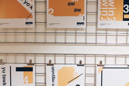
these photos show my project displayed at the end of year exhibition…


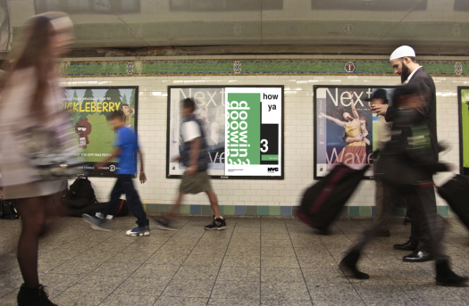
below i had some fun and tried to invisage what my posters would look like in real life!